Getting Started
Chitmunk is a free, browser-based card designer for board game creators. Nothing to install, nothing to pay for to try it. Open chitmunk.com/home, pick from 170+ starter templates or a blank canvas, and your design saves locally as you work. This guide walks through the basics: opening the editor, choosing a component type, adding text, images, shapes, and backgrounds, then saving and exporting your first card. Everything in this guide works on the free Common plan.
Opening the Editor
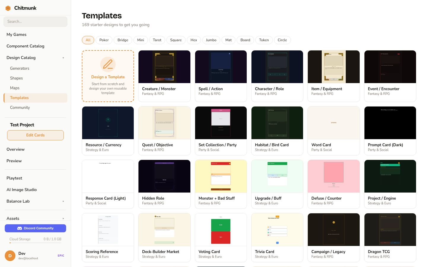
To start designing, head to chitmunk.com/home. The dashboard loads instantly and you can begin creating right away. On your first visit, you will be prompted to choose from 170+ built-in starter templates or start with a blank canvas.
Tip: Chitmunk saves your work automatically. If you close the tab and come back, your last design will still be there.
Interface Overview
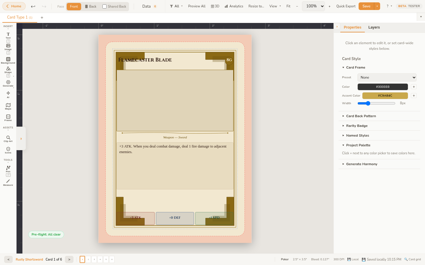
The editor is divided into a few key areas:
- Toolbar (top): Contains undo/redo, the Face switcher (front/back tabs), Data toggle, view options, zoom, quick export, and save controls. A Back to Home button in the top-left corner returns you to the Game Home dashboard. The Help dropdown in the top-right gives you access to the Guided Tour, Keyboard Shortcuts, Help Topics, Guides, What's New, and About.
- Tool Strip (left edge): A vertical strip of icon buttons for adding elements: Text, Image, BG (background), Shape, Gen (generators), Table, AI (AI image placeholder), Maps, and Frame. Below those, Clip Art and Icon Tokens open their respective browsers. A Measure tool sits at the bottom.
- Canvas (center): This is your card. It shows the exact dimensions and proportions of your chosen card size. A bleed zone (the area that may be trimmed during printing) is shown around the edges. Rulers along the top and left display measurements in inches.
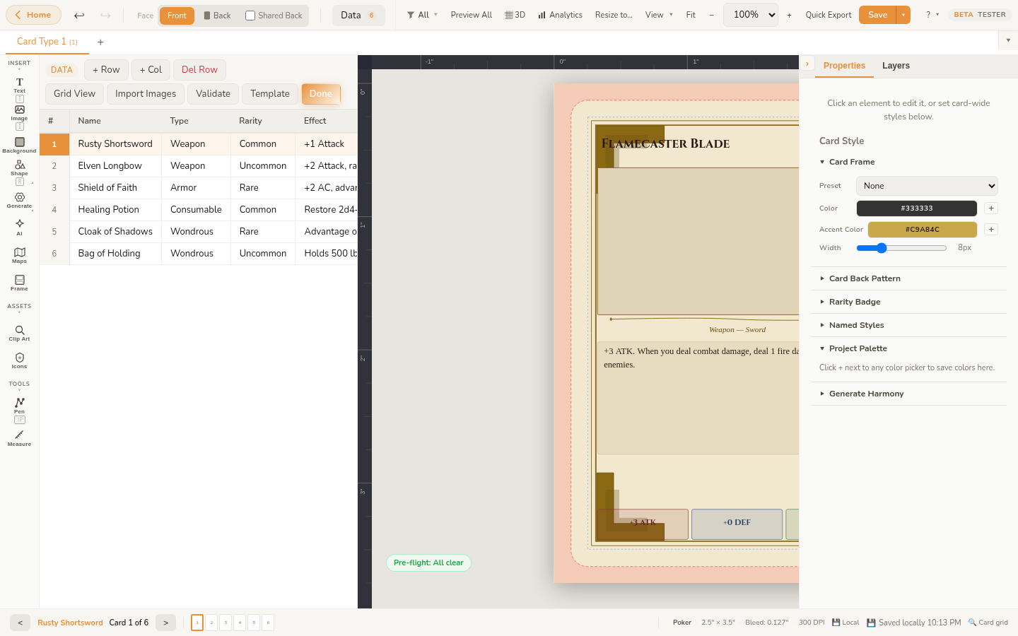
- Data Panel (left): Click the Data button in the toolbar to open the data panel on the left side of the editor, where you can import and manage CSV data for data merge. It displays a helpful hint reminding you to use
{{Column Name}}syntax in text elements to auto-fill from your data. Click the button again to hide the panel and maximize your canvas space. - Floating contextual toolbar: When you select an element, a compact floating toolbar appears above it with quick-access controls for the most common properties (font, size, color, alignment for text; fill, stroke for shapes; and so on).
- Properties Panel (right): When you select an element, its properties appear here: position, size, rotation, font settings, colors, and more. You can fine-tune every detail of your selected element.
- Layers Panel (right): Below the properties panel, the layers panel shows all elements on your card in stacking order. You can reorder, rename, lock, and toggle visibility of elements here.
Choosing a Component Type
Before you start designing, pick the type of component you are making. Right-click the component tab in the top-left corner (it shows your current type, like "Card Type 1") and choose Change Type…. Chitmunk supports over 200 component types across 27 categories: standard card decks, tiles, boards, punchouts, boxes, booklets, and more. Each type defines the exact dimensions and bleed zones required for printing.
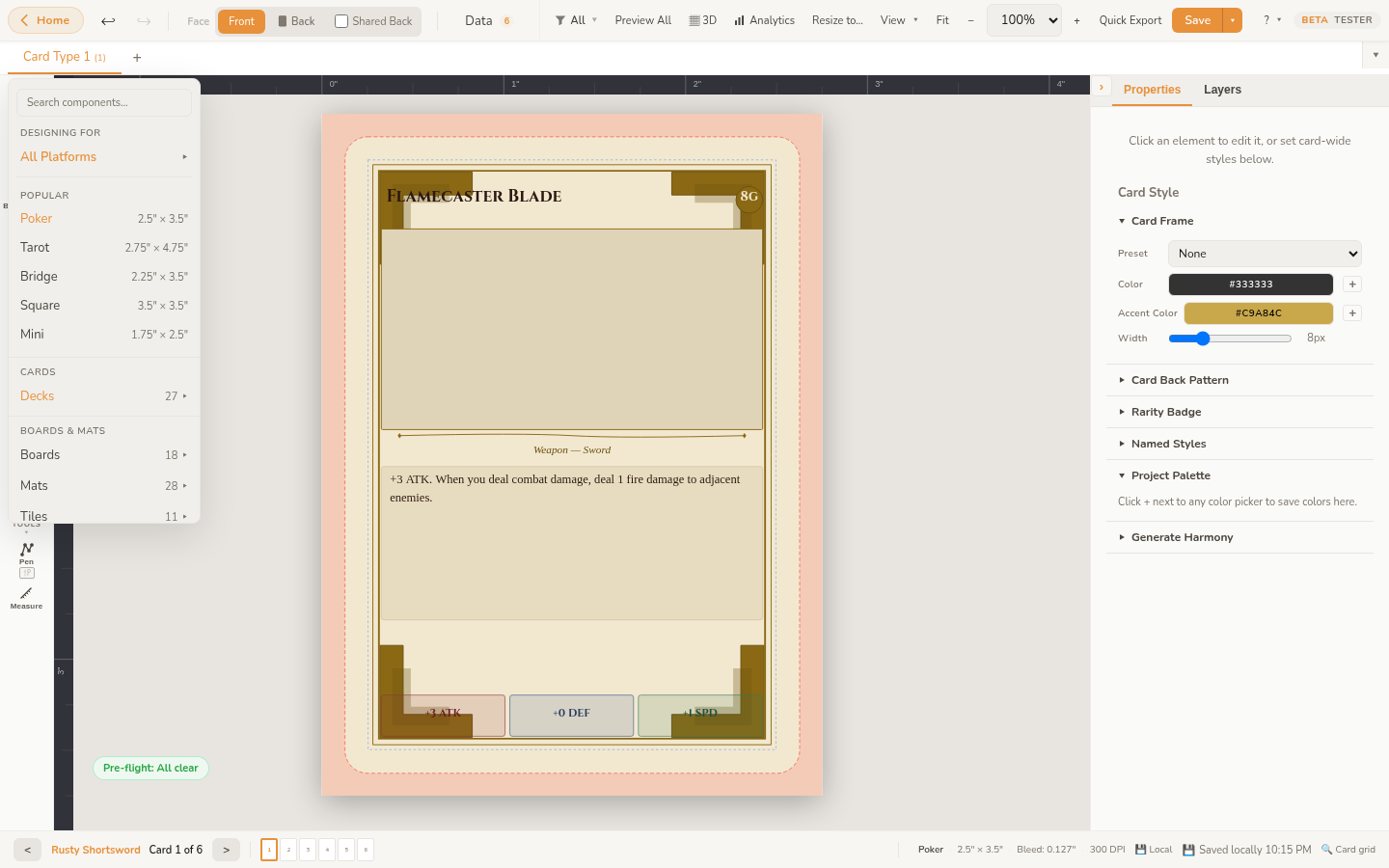
Tip: You can change your component type at any time. Your design elements will be preserved, though you may need to reposition them if the new size is different.
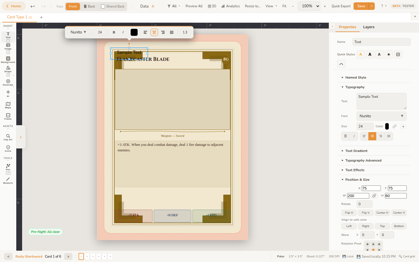
Adding Text
Click the Text button in the tool strip (left edge of the canvas) to add a text element. A new text box appears on the canvas with placeholder text. To edit it:
- Double-click the text element on the canvas, or select it and edit the text field in the properties panel.
- Use the properties panel to change the font family, font size, weight (bold), style (italic), color, and text alignment.
- Drag the corners of the text box to resize it. Text will wrap within the box and auto-shrink if it overflows.
Chitmunk includes access to over 1,000 Google Fonts and supports custom font uploads (see the Custom Fonts guide). You can also apply text effects like curved/arc text and adjust letter spacing.
Adding Images
Click the Image button in the tool strip to add an image element. You can:
- Upload a file: A file picker opens where you can select an image from your computer (PNG, JPG, SVG, WebP).
- Drag and drop: Drag an image file from your file explorer directly onto the canvas.
Once added, use the properties panel to adjust the image fit mode (fill, contain, cover), opacity, and position. Images are stored in your browser's IndexedDB, so they persist between sessions without needing to upload again.
Clip Art Browser
Click the Clip Art button in the tool strip to open the Clip Art Browser. This panel gives you quick access to all built-in visual resources without leaving the editor:
- Icons: Search across 275K+ icons from Iconify. Recolor them and drop them directly onto your canvas.
- Kenney Game Art: Browse 523 CC0-licensed board game art from Kenney: dice, meeples, tokens, and more.
- Patterns: 32 seamless SVG tiling patterns you can apply as backgrounds.
- Uploaded Images: Quick access to images you have already uploaded to the current project.
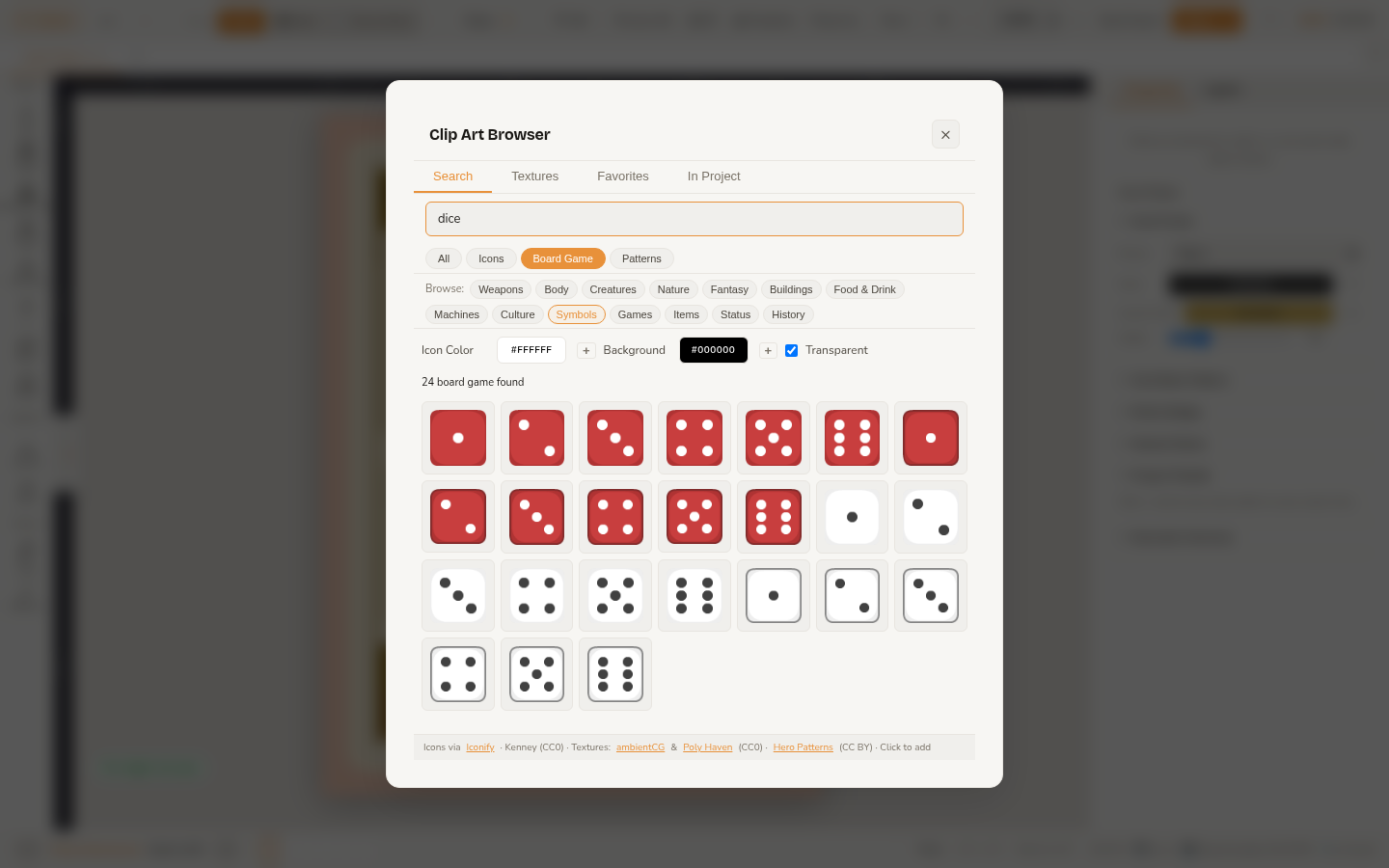
Click any asset to add it to your canvas, or drag it to position it exactly where you want.
Image Filters
Select an image element and scroll down in the properties panel to find brightness, contrast, and saturation sliders. These let you adjust the look of your images without leaving Chitmunk.
Adding Shapes
Click the Shape button in the tool strip to open a visual palette with 22 shape types. Click any shape tile to add it to your canvas. Shapes include rectangles, ellipses, polygons, lines, stars, arrows, diamonds, crosses, shields, banners, hexagons, gears, spirals, and more.
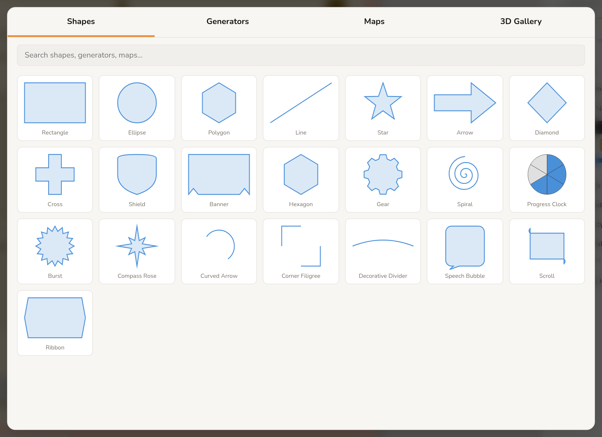
All shapes support fill color and opacity, stroke color and width, and dashed stroke patterns. Customize these in the properties panel after selecting the shape. See the Shapes & Decorations guide for the full list and styling options.
Adding Backgrounds
Click the BG button in the tool strip to add a background element. Backgrounds fill the entire card area including the bleed zone. You can set a solid color, upload an image, or use one of the 32 built-in SVG tiling patterns available in the Clip Art Browser.
Tip: Backgrounds are just elements: you can have multiple, layer them, and adjust their opacity. This is great for creating textured or gradient effects.
Selecting and Moving Elements
Click any element on the canvas to select it. A selection outline with handles appears around the element. You can then:
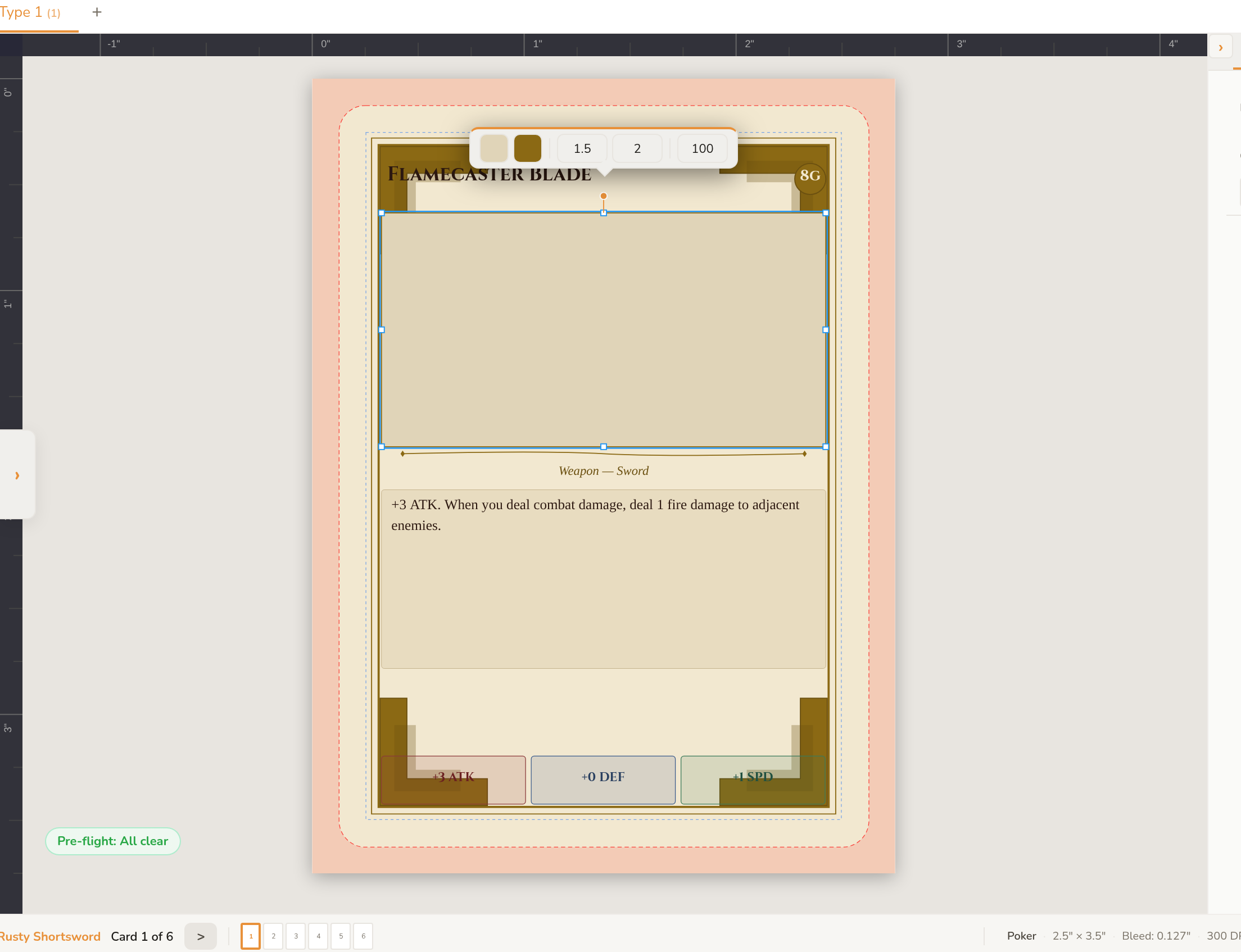
- Move: Click and drag anywhere inside the selection to reposition the element.
- Resize: Drag any of the corner or edge handles. Hold Shift while dragging a corner to lock the aspect ratio.
- Rotate: Drag the circular handle that appears above the selection. Hold Shift to snap to 15-degree increments.
- Nudge: Use arrow keys to move the selected element by 1 pixel at a time. Hold Shift for larger increments matching your grid size.
To select multiple elements, hold Ctrl and click additional elements, or click and drag on an empty area to draw a selection box. With multiple elements selected, you can move, align, and distribute them as a group.
Note: On macOS, use Cmd instead of Ctrl for all keyboard shortcuts.
Grouping Elements
Select multiple elements and press Ctrl+G to group them. Grouped elements move, resize, and rotate together as a single unit. Press Ctrl+Shift+G to ungroup.
Flip and Anchor Points
You can flip elements horizontally (Shift+H) or vertically (Shift+V) using the buttons in the properties panel or keyboard shortcuts. The anchor point controls the center of rotation and flipping: use the 9-point grid in the properties panel to set it (top-left, center, bottom-right, etc.).
Exporting Your Work
When your design is ready, head to the Game Home dashboard (click Home in the top-left corner) to access all export options:
- Image ZIP: Export all card faces as PNG, JPEG, or WebP images bundled into a ZIP file.
- PDF: Generate a multi-page PDF with crop marks for professional printing (requires Rare subscription).
- TTS Spritesheet: Create a single-image grid for Tabletop Simulator (requires Rare subscription).
- TGC Upload: Upload your project directly to TheGameCrafter for print-on-demand production (requires Rare subscription).
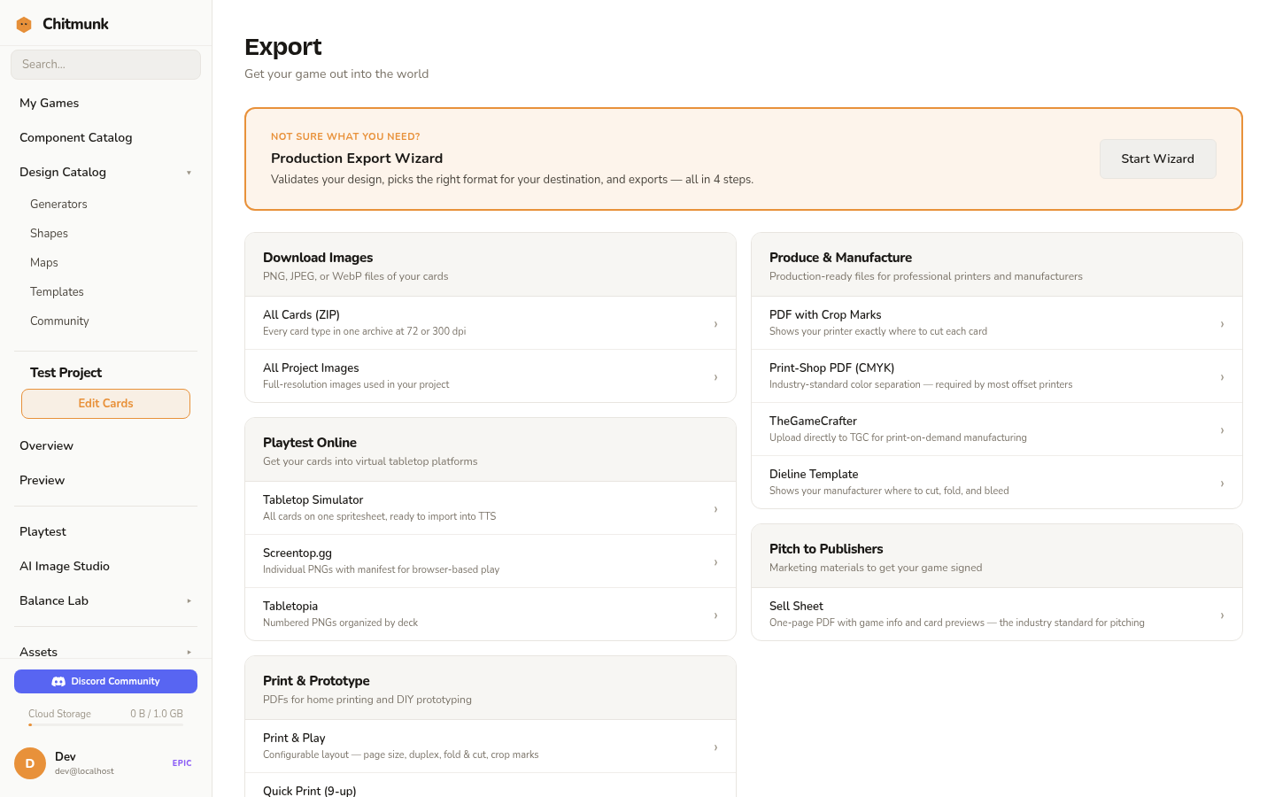
You can also use the Quick Export button in the toolbar for a fast 72dpi PNG of the current card. See the Print-Ready Checklist guide for detailed export settings and preparation tips.
Saving Your Work
Chitmunk autosaves your active project continuously. For explicit saves, use the Save button in the top-right corner of the toolbar. Click the dropdown arrow next to it to choose a destination:
- Quick Save: Saves to your most recent location.
- Save Locally: Stores the project in your browser's local storage.
- Save to Chitmunk Cloud: Stores your project in Chitmunk Cloud so you can access it from any browser (1 GB free, 50 GB with Rare subscription).
- Save to Google Drive: Stores a copy in your Google Drive.
- Save to OneDrive: Stores a copy in Microsoft OneDrive.
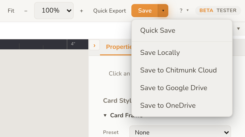
You can also export your project as a portable file (JSON + images in a ZIP) to back it up or share it with someone else.
Game Home Dashboard
Click Home in the top-left corner of the editor to open the Game Home dashboard. This is your project hub where you can:
- See all your saved projects and manage them.
- Access export, preview, playtest, and analytics tools.
- Browse the Design Catalog for templates, generators, and tools.
- Manage Chitmunk Cloud projects and sharing.
- Create new projects from scratch or from templates.
Multi-Card-Type Projects
Most board games have more than one type of card. Chitmunk lets you work with multiple card types in a single project using tabs in the toolbar. Each tab has its own component type, canvas size, design, CSV data, and undo/redo history. Tabs are draggable, so you can reorder them.
Click the + tab to add a new card type. You can copy and paste elements between card types using Ctrl+C and Ctrl+V.
Next Steps
- Keyboard Shortcuts: Learn all the shortcuts to speed up your workflow.
- CSV Data Merge: Generate unique cards from spreadsheet data.
- Templates: Start from a pre-built card layout instead of a blank canvas.
- Print-Ready Checklist: Prepare your design for professional printing.
- TheGameCrafter Upload: Upload your project directly to TheGameCrafter for print-on-demand.